Menu
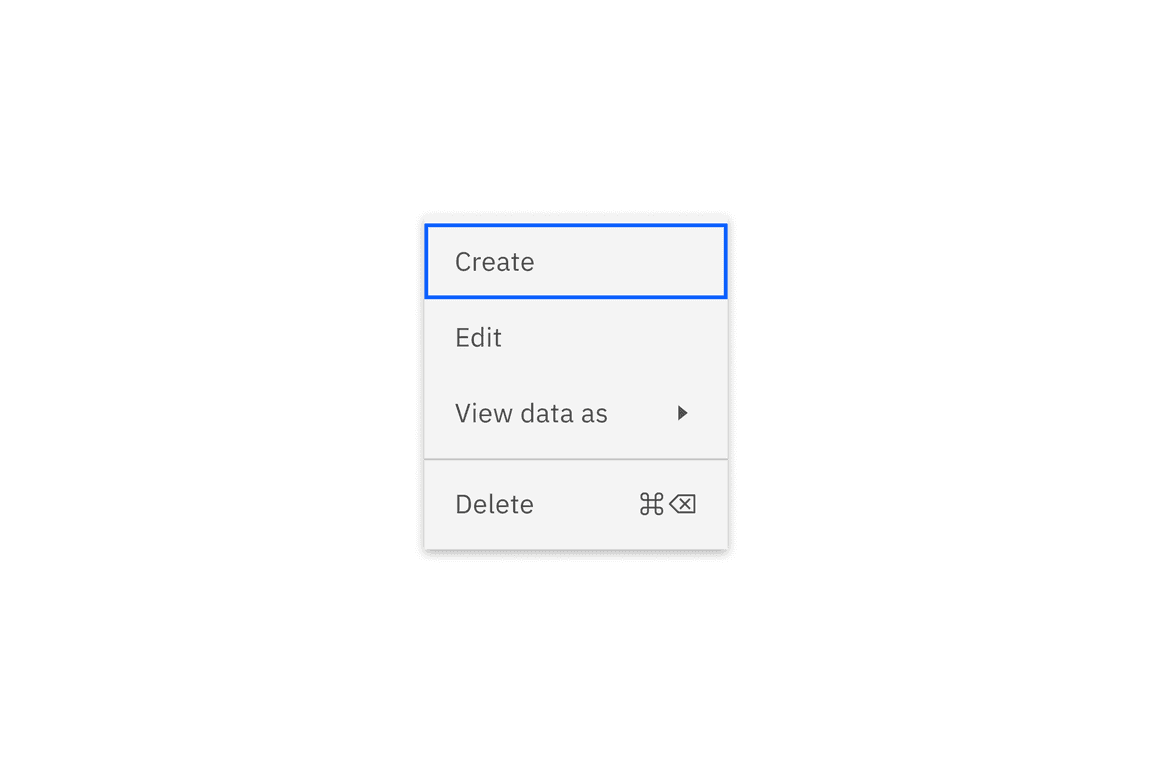
The following page documents visual specifications such as color, typography, structure, and size.
Color
| Elements | Property | Color token |
|---|---|---|
| Menu option | background-color | $layer * |
| text-color | $text-secondary | |
| border-top | $border-subtle * | |
| Caret icon | svg | $icon-secondary |
| Shortcut icon | svg | $icon-secondary |
| Container | box-shadow | 0 2px 6px 0 rgba(0,0,0,.2) |
* Denotes a contextual color token that will change values based on the layer it is placed on.
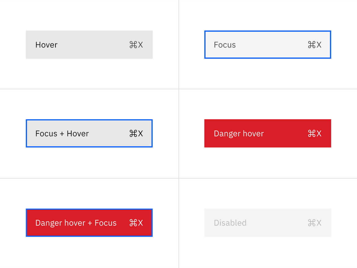
Interactive state color
| State | Element | Property | Color token |
|---|---|---|---|
| Hover | Menu option | background-color | $layer-hover * |
| Menu option | text-color | $text-primary | |
| Icon | svg | $icon-primary | |
| Focus | Menu option | background-color | $layer* |
| Menu option | border | $focus | |
| Focus and hover | Menu option | background-color | $layer-hover * |
| Menu option | text-color | $text-primary | |
| Icon | svg | $icon-primary | |
| Menu option | border | $focus | |
| Danger hover | Menu option | background-color | $support-error |
| Menu option | text-color | $text-on-color | |
| Icon | svg | $icon-on-color | |
| Danger hover and focus | Menu option | background-color | $support-error |
| Menu option | text-color | $text-on-color | |
| Menu option | border | $focus | |
| Icon | svg | $icon-on-color | |
| Disabled | Menu option | background-color | $layer * |
| Menu option | text-color | $text-disabled | |
| Icon | svg | $icon-disabled |
* Denotes a contextual color token that will change values based on the layer it is placed on.
Typography
| Element | Font-size (px/rem) | Font-weight | Type token |
|---|---|---|---|
| Menu option text | 14 / 0.875 | Regular / 400 | $body-compact-01 |
Structure
| Element | Property | px / rem | Spacing token |
|---|---|---|---|
| Icon | icon size | 16 / 1 | – |
| Option (default) | padding-right, padding-left | 16 / 1 | $spacing-05 |
| Option (selectable but unselected) | padding-right, padding-left | 16 / 1, 40 / 2.5 | $spacing-05, $spacing-08 |
| Option (selectable and selected) | padding-right, padding-left | 16 / 1 | $spacing-05 |
| Option (next to the divider) | margin-top, or margin-bottom | 4 / .25 | $spacing-02 |
| Option (first and last) | margin-top, or margin-bottom | 4 / .25 | $spacing-02 |
| Divider | margin-top | 1px | – |
Default menu structure
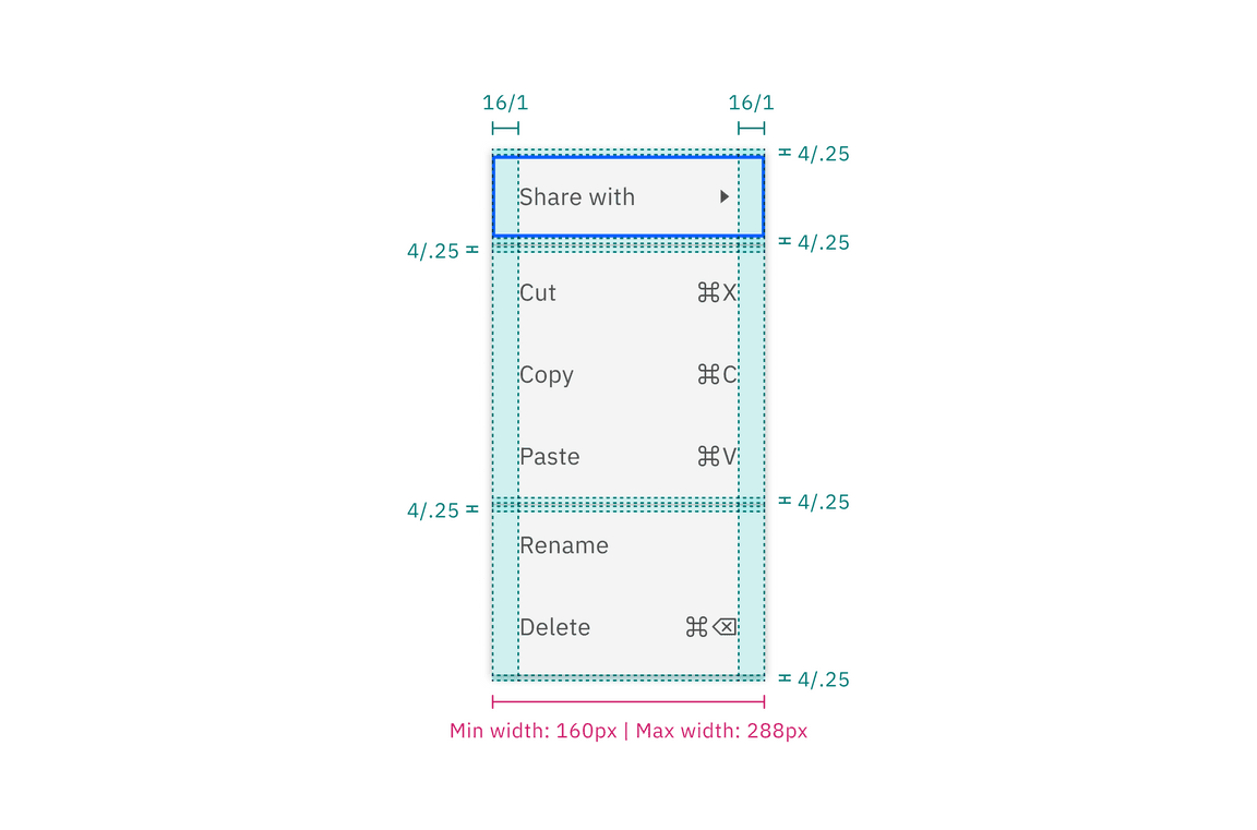
Structure and spacing measurements for main menu
Submenu structure
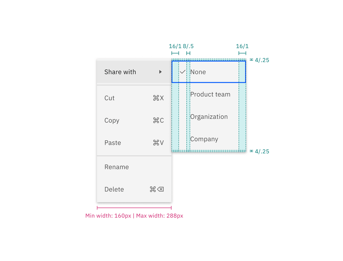
Structure and spacing measurements for submenu
Menu option structure
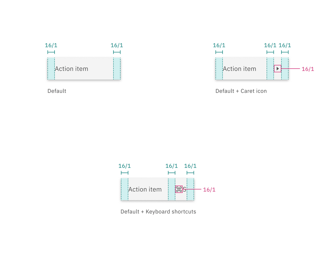
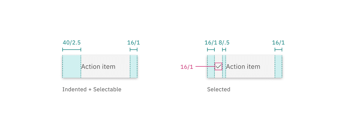
Structure and spacing measurements for individual menu options
Size
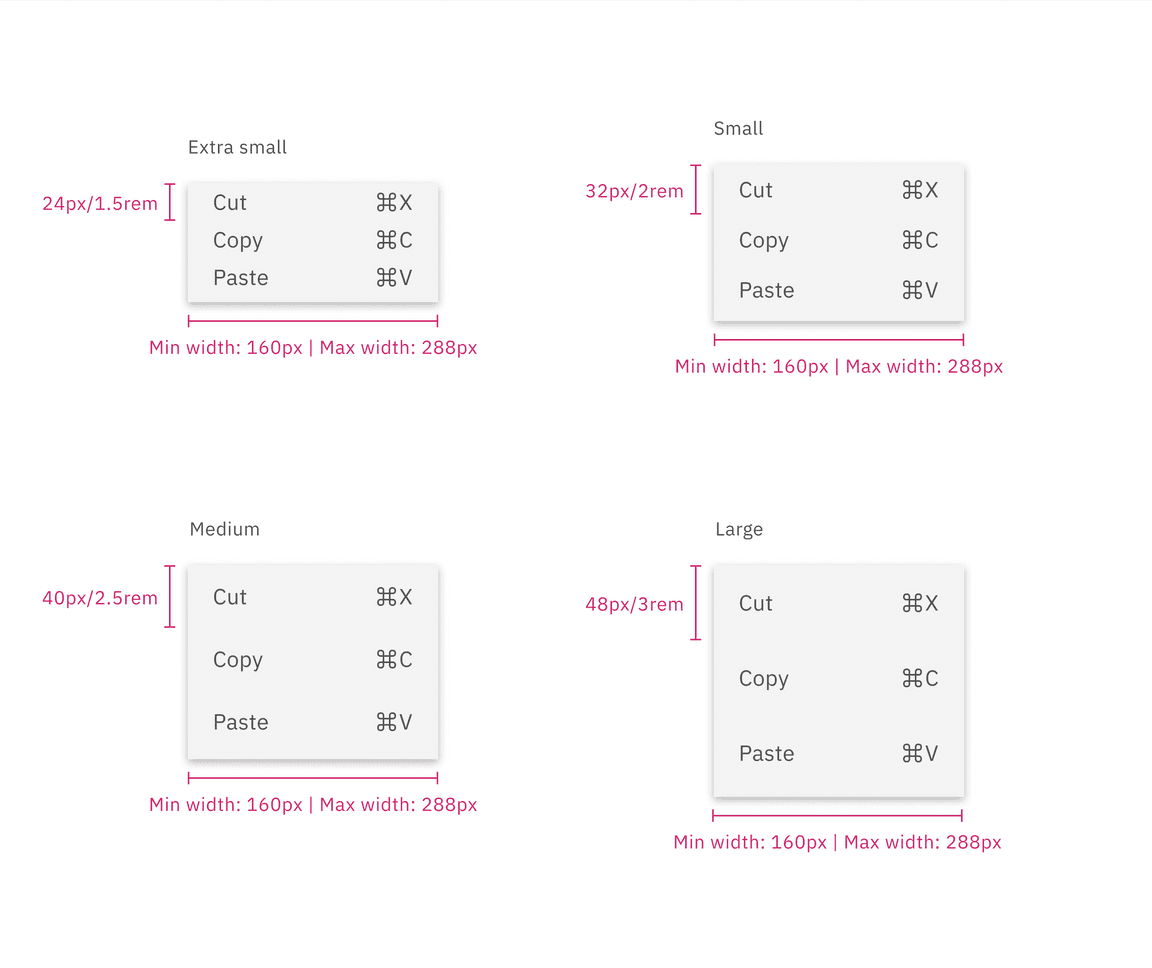
There are four menu option sizes: extra small, small, medium, and large. The height of a menu is determined by a menu button. Menus have a fixed minimum width of 160px (or 10rem), to ensure menu items have sufficient horizontal space, while also having a fixed maximum width of 288px (or 18rem).
| Elements | Size | Height (px/rem) |
|---|---|---|
| Menu option | Extra small (xs) | 24 / 1.5 |
| Small (sm) | 32 / 2 | |
| Medium (md) | 40 / 2 .5 | |
| Large (lg) | 48 / 3 |
Feedback
Help us improve this component by providing feedback, asking questions, and leaving any other comments on GitHub.